Truthfulness in the digital age ?
Leica APO-Summicron-SL 90/2 ASPH.
My third official review of photographic equipment is about the monumental Leica Apochromatic Summicron-SL 90mm f/2 Aspherical.
Quite a name, as you've probably noticed. But Leica has never shied away from embracing the very principles that make this optical formula fundamentally different from the rest.
The Aspherical designation is no marketing embellishment. An aspherical surface remains one of the most effective ways of reducing spherical aberration and coma while maintaining exceptionally high performance all the way to the edges of the frame, contributing to an optical design capable of remarkably smooth transitions between high and low contrast spatial frequencies.
Nor could Leica dispense with the Apochromatic designation. This optical formula does far more than simply bring the primary wavelengths of the visible spectrum onto the same focal plane. It also suppresses the secondary spectrum - that is, the minute residual chromatic errors that remain even after conventional correction.
As for the focal length and the maximum aperture, we'll be going far beyond the numbers.
So pour yourself a coffee, a cup of tea, a glass of wine, a whisky - or whatever suits you best, perhaps even two - and come along.
This will be a long journey, a deep one, and, I hope, a fascinating one.
From the very beginning, I'd like to question the very notion of the portrait lens. If you've read my previous work, you already know that I enjoy challenging established assumptions in order to better understand what we're truly dealing with. In my review of the Leica M EV1, I explained why I am not, and never will be, a photojournalist. Here, I'll tell you something else: I am not, and never will be, an influencer. My only motivation has always been and will always remain: art.
And now that the clocks have finally been set to the right time, let's move on: what exactly is a portrait lens?
The question is broader than it first appears, but by 2026 a reasonable consensus seems to have emerged. Any focal length between roughly 75 and 135mm, offering at least an f/2.8 maximum aperture and a minimum focusing distance of approximately 80 to 100 centimetres, already satisfies most of the practical requirements of portrait photography.
I deliberately broaden that definition, because I prefer understanding phenomena to confining them within arbitrary categories.
Add a reproduction ratio approaching 1:5, and we arrive at what has traditionally been considered a portrait lens.
But you see, if things were really that simple, the AI-powered Portrait Mode on our smartphones would be enough to turn anyone into a portrait photographer. One hand on the screen, the other in your pocket, and the profession would take care of itself.
Unfortunately, great portrait photography has never been born from a single click made wide open.
As for optical performance, photographic discussions over the past several years seem to have reduced it to little more than a question of sharpness and correction.
Yet two lenses with nearly identical resolving power can produce images whose perceived rendering is profoundly different.
The explanation lies not merely in resolution itself, but in how consistently contrast is preserved across the entire range of spatial frequencies, in the smoothness of their MTF curves, in the coherence of their residual aberrations, and in the stability of their behaviour from the centre of the frame all the way to its edges.
Rather than pursuing maximum sharpness alone, the finest lenses seem to pursue something else: optical continuity.
And it may well be this very continuity that our brains ultimately perceive as transparency, depth, and a compelling sense of naturalness.
So then... what about this Leica lens?
Apparently expensive enough to make one cry poverty, five millimetres longer than most 85mm lenses favoured by Canon shooters, Nikon devotees, and the other relentless defenders of what they consider reasonable, while opening "only" to f/2 when so many proudly boast f/1.4—or even f/1.2...
What an outrage. Unless, of course, the real outrage lies elsewhere. Because asking well over €2,000, and sometimes more than €3,000, for lenses based on ultimately rather conventional optical formulas, admittedly refined to an exceptional degree, only to replace them a few years later with a new generation offering little more than marginal improvements, perhaps deserves greater scrutiny.
By contrast, the APO Summicron-SL 90mm, introduced back in 2018, appears to follow a radically different philosophy. Designed with enough optical headroom to exploit today's sensors effortlessly - and, in all likelihood, those well beyond the 100megapixels mark - manufactured to exceptionally tight tolerances, and contributing, when paired with a compatible Leica body, to an IP54 weather-sealed system, it feels less like a consumer product than a precision instrument built to outlive technological cycles. Once it finds its place in your lens collection, chances are it will resemble a family heirloom far more than a future second-hand listing.
By now you've probably realised that this review won't quite be like the others.
And no, I don't make an effort to be provocative or stubborn. It comes perfectly naturally to me - which may well explain why solitude has never really bothered me. Haha.
Well then. The introduction has been long enough. Let's finally meet the beast.
Leica presents this lens as one of the greatest achievements of its recent history, alongside the APO Summicron-SL 35mm and 75mm. Having studied Leica's official MTF charts, compared them with those of the integrated 43mm f/2 APO lens in my Q3 43, and, above all, spent considerable time using it in the field, I understand exactly why.
Sharpness is exceptional across the entire frame. Every optical aberration is corrected to a level that is rarely encountered. Contrast remains remarkably high regardless of focusing distance, from minimum focus all the way to infinity. Backlit scenes, night photography, landscapes, portraits, fine detail - this lens seems to move effortlessly through virtually every photographic situation.
Yes, this is precisely what one would expect: an optical design that comes remarkably close to perfection wide open, while maintaining extraordinary performance at least up to f/11.
To my eyes, it even surpasses the already outstanding 43mm f/2 APO built into the Leica Q3 43.
For the sake of brevity, however, I will simply encourage you to read Leica's own technical papers. There, Peter Karbe, the company's Head of Optical Design, explains with remarkable transparency the engineering decisions that shaped this lens. The numbers speak for themselves - but more importantly, we'll try to understand what they actually mean.
Interestingly enough, some photographers describe this family of lenses as "too perfect", "over-corrected", or even "clinical". Whether we consider it a taboo or not, the criticism appears often enough to deserve serious attention.
Over the past few years, a growing trend has emerged: deliberately seeking lenses that retain certain technical imperfections - geometric distortion, vignetting, flare, residual aberrations, or even modest resolving power, supposedly kinder to skin retouching - on the grounds that these flaws constitute their "personality", giving images a distinctive character. Modern RAW/DNG processors, retouching software, and today's fashionable presets - LUTs in the world of video - can then correct whatever is considered undesirable while adding a particular "look", all without sacrificing that celebrated "character".
I know this approach well. My MacBook Pro hosts most of those applications, and I use many of them myself.
But we first need to distinguish between two concepts that are too often confused: an optical signature and an optical defect.
A signature is the result of deliberate design. A defect is a technical limitation.
Both may sometimes produce an aesthetic that people find appealing, but they stem from fundamentally different philosophies.
And this is where I deliberately take a position: if the personality of a photograph depends primarily on the imperfections of the lens that produced it, then that personality belongs more to the lens than to the photographer.
Personally, I would rather that personality arise from the eye behind the camera, from the light, the subject, the composition, and the decisive moment. A lens should not create the image on my behalf. Nor should it compensate for a lack of inspiration or talent. Its role is simply to transmit, as faithfully as possible, the photographic vision I have already constructed in my mind before pressing the shutter.
That is not to say everyone should pursue optical perfection. Everyone is free to prefer a softer, older, or more expressive rendering, and my fifteen years of experience could just as easily be devoted to analysing those aesthetics.
But describing extraordinary optical correction as "too perfect" or "soulless" strikes me as profoundly unfair to the engineers who sometimes devote years of their lives to pushing the boundaries of their discipline.
On the contrary, it fails to acknowledge the extraordinary passion invested in these exceptional optical achievements.
Let's be honest. If a lens appears "too perfect", perhaps the more relevant question is not whether the lens lacks personality...but whether the photographer does.
So let us give the work of designers such as Peter Karbe, and Leica's optical engineering teams as a whole, the respect it deserves. These lenses are not merely luxury consumer products - believe me, I know how to write that kind of criticism when it is warranted... They represent the very summit of what contemporary photographic optics is capable of achieving.
One fundamental question still remains: what, exactly, do we call optical perfection?
Sharpness? Contrast? MTF curves? The absence of chromatic aberration? A neutral bokeh? Geometric fidelity?
Or rather, a far subtler combination of all these parameters?
That is precisely what we are about to explore, in real-world situations, beginning with the simplest examples, all shot wide open at f/2.
Because we all love to travel, let's start with an airplane.


I see virtually no chromatic aberration or loss of sharpness here. Yet, a metallic aircraft fuselage, photographed in the harsh midday light, is precisely one of the most demanding scenarios for a lens. Specular reflections, extremely abrupt transitions between highlights and shadows, metallic contours silhouetted against a bright sky, and very strong differences in luminance immediately reveal the slightest weakness in chromatic correction. Where many lenses show fine purple or green fringing, the Leica APO Summicron-SL 90mm simply seems to... ignore it. And rightly so, because it would be quite unsightly.
Moreover, it's not just a matter of aesthetics. Each colored fringe represents a portion of the light information that wasn't focused in exactly the same place as the other wavelengths. When these differences become negligible, the edges regain their neutrality, local contrast becomes more legible, and the image acquires that impression of purity that many rightly call transparency.
But let's continue with mundane but edifying topics , in broad daylight.


We could have seen some anomalies here too. Do you see them? I still don't.
Otherwise, how are our alien neighbors doing?


Well, if we continue to enlarge the image we might become indecent, and besides, we don't really want to know more about what's happening on the Moon, do we.
Zeiss was able to work with NASA and Stanley Kubrick to develop the formula for the 50mm f/0.7 lens, essential at the time - an episode now more associated with various conspiracy theories, which interest us far less than his masterpiece "Barry Lyndon," made possible thanks to this lens. Leica on the other hand allows us to see the Moon as if it were within reach, without filters, without a tripod, without any other aid, simply and directly, on a summer evening, without controversy or platitudes, by opening the aperture to f/2: there it is, clearly visible, and it's round, too...
I'm not sure the second feat is less impressive than the first, in my opinion.
Back to Earth!


So, if chromatic aberrations are lacking, and the resolution might make you somewhat of an astronomer or botanist, perhaps you will notice, in this next example, a decrease in sharpness at full aperture and against the light?


After all, this would be perfectly normal: backlighting is one of the most demanding exercises for a lens. Stray light circulating within the optical formula tends to reduce contrast, blur the finest details, and gradually make the subject lose its presence.
But here again, none of that applies. The subject remains perfectly legible, with good contrast and firmly anchored in the image. As if this optical formula knew how to take advantage of the light rather than be controlled by it.
The quality of an image does not depend solely on its resolution, nor on the number of megapixels of its sensor. It's the ability of the optical system to preserve contrast when details become increasingly fine that really matters.
Two lenses can resolve a very similar level of detail, but the one that best preserves contrast across all spatial frequencies will produce an image that appears more natural, more legible, and often more "transparent".
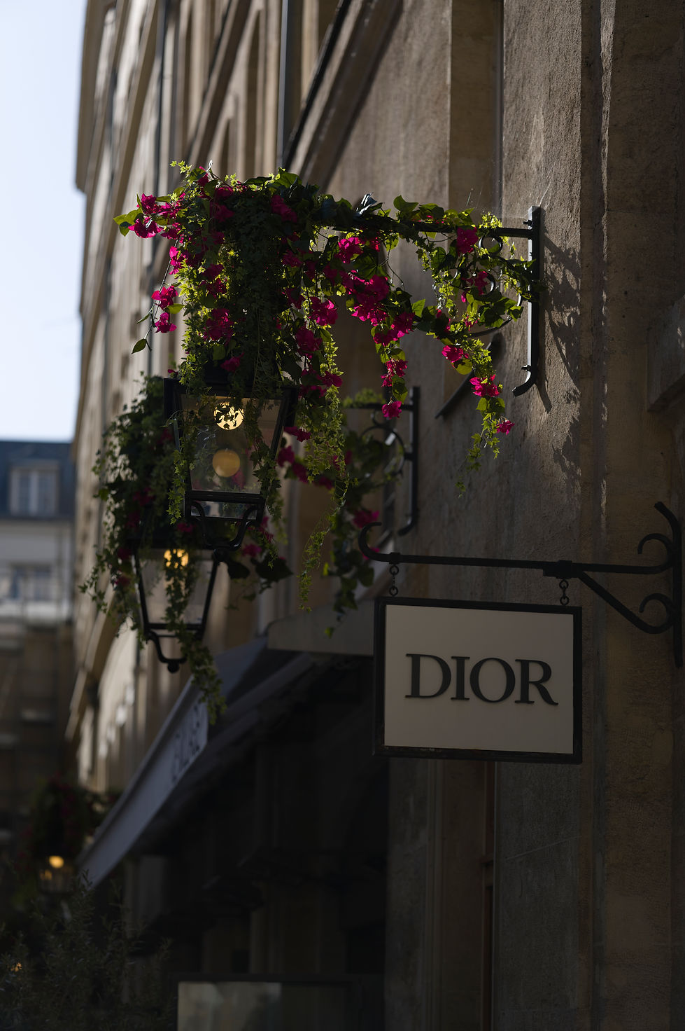
To stick with mundane topics, does an aperture of f/2 really seem insufficient to allow the subject to stand out from its surroundings? When no other argument remains, this is one of the first criticisms leveled at this type of lens: "only f/2".
Let us therefore observe the relationship between the subject and its background.
In influencer jargon, we often talk about "3D Pop". Faced with a photograph which remains, until proven otherwise, a two-dimensional surface, I must admit that this expression has always left me perplexed.
However, this feeling definitely exists.
What many call "3D Pop" is nothing more than the visual relationship of excellent preservation of micro-contrast on the subject, to extremely blurry out-of-focus areas.
In reality, it is the gradual yet rapid, controlled transition from one plane to another, thanks to a very low level of residual aberrations, that allows for the particularly clear separation between the different planes of the image. In other words, it is not the blur that creates this impression of depth, but the quality of the transition between sharpness and blur.
Observe this image: filled with closely spaced, similar elements, lacking a subject that naturally stands out without the focus granting it priority over the other elements. Does the subject appear to detach itself naturally from the background despite this? Do you get the impression that it occupies its own space, without the background interfering with its perception?
If the answer is yes, then congratulations: you have just observed what is sometimes called, a little too hastily, "3D Pop".
You can now open a video channel and talk about it for twenty minutes, while the player is interrupted at least 3-4 times by advertisements whose duration is almost as agonizing as the technical definitions themselves.
For my part, I prefer to understand why this feeling exists rather than give it a name, since a label has never been an explanation.


Let's leave aircraft, celestial bodies, plants, and skyscrapers behind, and turn to the subject that interests us most when discussing the APO Summicron-SL 90mm: portraiture.
In this field, one often hears - rather casually - that the whole story ultimately comes down to sharpness wide open and background blur, supposedly giving the image that coveted three-dimensional look we just mentioned.
I believe the reality is considerably more nuanced.
A large maximum aperture does, of course, reduce depth of field and produce stronger background blur. Combined with the impression of exceptional sharpness on a nearby subject, the result is perfectly predictable - not only aesthetically, but geometrically as well.
A blurrier background alone, however, is not what creates the impression of depth that so many people conveniently summarise as 3D Pop.
I hear this association made regularly with lenses such as the Sigma 135mm f/1.8 Art, Sony's FE 85mm f/1.4 GM II, Canon's and Nikon's 85mm f/1.2 lenses, and even some of Viltrox's latest designs. These are all outstanding lenses, several of them exhibiting truly remarkable optical performance. Among those I have personally used, the Sony indeed stands out for its particularly high local contrast, which undeniably contributes to the subject's visual presence.
But correlation should never be mistaken for causation - especially when the underlying mechanisms remain unexplained.
The apparent depth of an image results from several factors working together simultaneously: the preservation of contrast at the finest spatial frequencies, the quality of the transitions between in-focus and out-of-focus regions, the suppression of chromatic aberrations, the minimisation of stray light, the consistency of textures, and the stability of performance across the entire image field.
It is precisely this combination that seems to define the finest apochromatic lenses.
A brief historical detour is worthwhile.
For decades, optical engineers pursued ever-faster lenses for one very practical reason above all others: to transmit more light to the film - and later, to the sensor. Photographing in difficult lighting conditions, using faster shutter speeds, or working at lower sensitivities were the real motivations behind this relentless race towards larger apertures.
With the spectacular progress of digital sensors - now capable of producing remarkably clean images at ISO values that would once have seemed unimaginable - the discussion gradually shifted.
For many photographers, extremely fast apertures became less of a technical necessity than an aesthetic statement.
Then came a conveniently simple idea: "My 85mm f/1.2 is better for portraits than your mere f/2." And almost immediately, 3D Pop became the latest buzzword.
The reality, however, is considerably less spectacular.
If a subject genuinely appears to separate itself from its surroundings, it is first and foremost because the photographer has created that separation through composition, lighting, viewpoint, and the careful management of distances between the different planes of the scene.
The lens merely amplifies - or faithfully preserves - that intention.
From a purely optical perspective, what first captures our attention is not necessarily the amount of blur itself, but the way the subject retains its finest contrast relationships while the background progressively loses its own.
It is not so much the aperture that creates this impression of depth, but the consistency with which the lens transmits optical information.
In other words, spectacular blur is excellent at attracting the eye. An exceptional lens, on the other hand, gives the subject presence.
Still not convinced?
Then allow me to provide a little context before we continue.
Here is a comparison between two lenses widely regarded as benchmarks for portrait photography: the Sigma 135mm f/1.4 Art (left/top) and Sony's latest-generation FE 85mm f/1.4 GM II (right/bottom).


The difference between a remarkable 135mm f/1.4 and an excellent 85mm f/1.4 isn't simply a matter of focal length or aperture. It lies primarily in how each renders the subtlest variations in contrast - in other words, what's commonly referred to as micro-contrast. On this specific point, the Sony FE 85mm f/1.4 GM II seems to maintain a slight advantage over the Sigma 135mm f/1.4, whose rendering, while exceptional, appears slightly lacking in very fine textures.
The experience is interesting, by the way.
If it were simply a matter of focal length to aperture ratio, the Sigma should theoretically produce a significantly greater sense of depth. At 135mm, it offers a tighter framing and, at the same aperture, a shallower depth of field for the same framing. Many would spontaneously conclude that the subject should naturally "pop out" of the image more.
However, upon closer observation, things are more nuanced.
The Sigma does indeed produce greater separation between the subject and the background, a logical consequence of its focal length and depth of field. In contrast, the Sony often gives the subject a slightly more assertive presence thanks to a more energetic rendering of micro-contrasts and the finest textures.
In other words, the Sigma separates the planes more, while the Sony sometimes seems to bring the focus plane to life better.
This distinction is essential, because it shows once again that the sensation of depth does not depend exclusively on the amount of blur produced by a lens. It also depends - and perhaps above all - on the quality with which the lens preserves contrast relationships within the subject itself.
Here is another example shot with the Sigma 135/1.4, again in monochrome. This choice is not insignificant: by removing color information, our attention is focused almost exclusively on the volumes, textures, contrast transitions, and structure of the image. It is probably under these conditions that these differences become easiest to observe.


So what is really happening?
A lens that renders local contrast with particular energy generally possesses an optical signature that also influences the character of its out-of-focus areas. The overall rendering of an image is therefore never confined to the plane of focus alone.
This is one of the reasons why people often describe the Sony FE 85mm f/1.4 GM II as having a background blur that is slightly "harder" or more "present" than that of Canon's or Nikon's 85mm f/1.2 lenses - or, indeed, Sigma's 135mm f/1.4. And not simply because of the aperture.
By comparison, lenses such as the Samyang 85mm f/1.4 II or Sigma's latest Art series are often perceived as producing a softer out-of-focus rendering. To my eyes, however, they also reproduce local contrast with noticeably less energy.
The difference is immediately perceptible.
What strikes me most about the Sigma is the way it renders low spatial frequencies with remarkable authority, while the very highest frequencies seem to lose contrast a little sooner than they do on the Sony.
I am describing a perceptible tendency here, not an absolute truth.
The Sony, by contrast, appears to maintain greater consistency across the entire spectrum of spatial frequencies.
That, ultimately, is the reason for this little detour.
Understanding a lens often requires understanding it in the context of other lenses.
Today, however, we often seem to want photography to be both effortless to produce and immediately spectacular to look at.
So, from time to time, all sorts of rather questionable explanations begin to circulate.
The discussion is reduced until everything supposedly comes down to the relationship between a sharp subject and a background blurred into something resembling the eyesight of a respectable short-sighted gentleman who misplaced his glasses after a particularly enthusiastic evening involving far too much alcohol...
One has to laugh.
Not at being short-sighted or losing one's glasses, of course, but at the amusing similarity between the visual consequences of such evenings and the aesthetic demands of those who worship enormous apertures with rather little restraint.
And yet, some people will happily spend €3,500 on an 85mm f/1.2 while insisting that an APO Summicron is outrageously expensive. Viewed from that perspective, the reasoning itself seems rather... unreasonable.
For the sake of transparency, I want to clarify that Leica does not pay me at all for these reviews, nor have they provided me with any free gear, I am most likely just as invisible to them as I am to any other brand - especially given the flood of influencers with millions of views - so there is no need for any concern on that front. I am not sugarcoating my real-world experience, this is not an advertisement. In fact, I almost hope certain other brands don't come across this review, because constantly comparing spec-sheet promises with real-world realities makes me wonder if I’ll end up making more enemies than followers... haha!
I did warn you, though: I’m not cut out to be an influencer, don’t get your hopes up.
More seriously now, once one begins to appreciate the extraordinary complexity involved in designing a truly apochromatic optical formula, investing in an APO Summicron suddenly starts to look almost... reasonable.
But that requires accepting that there is more to a lens than its specification sheet.
A musical note is never just a frequency. It is a complex acoustic architecture composed of attack, resonance, decay, harmonics, and the countless interactions between them.
An image works in exactly the same way. A detail is never a single spatial frequency. It emerges from an extraordinarily intricate architecture of frequencies, transitions, and contrast relationships that our brain ultimately interprets as texture, material, or volume.
Judging a lens solely by its sharpness, its background blur, or its maximum aperture would be rather like judging a piano solely by the accuracy of its A note at 442 Hz and the length of its strings.
How many extraordinary musicians possess a profound understanding of their instrument without ever filling a stadium?
And how many artists with a far more accessible repertoire - and only a modest understanding of music itself - enjoy immense commercial success?
The point is neither to look down on the latter nor to idealise the former. It is simply how our era works.
Sophistication demands effort. Immediacy appeals almost effortlessly. And photography is no exception.
How many of you will have read this review all the way to the end? And among those, how many will truly integrate these ideas into the way they evaluate photographic equipment?
For that matter, I still own a Sony G Master. First, because despite all my efforts to understand these questions, I remain a very long way from being able to afford an entire set of APO Summicron-SL lenses.
Second, because in photography, as in music, with all due respect, you may one day be asked to perform more easy going musical scores rather than Beethoven's Op. 111. Obviously so, taste will always remain a wonderfully unpredictable thing.
The reality is that Leica APO Summicron-SL 90mm f/2 never relies on tricks. It does not seek to embellish the light, nor to disguise design compromises. Its ambition is simply to transmit light with the greatest possible fidelity.
That is precisely why I have spent so much time laying the groundwork before discussing the images themselves.
Lenses of this calibre are rare enough. People that are able and willing to understand them, are rarer still. And I had no intention of wasting either your time...nor mine.
Now, let's put these ideas to the test by comparing the Leica APO Summicron-SL 90mm f/2 directly with Sony's 85mm f/1.4 GM II.


If we only consider the background blur, do you see a big difference between the image on the left at f/2 and the one on the right at f/1.4?
For my part, beyond the two different poses, I see above all an overall gentleness emanating from Chloé's attitude, particularly well captured by this classic technique - pushed here to its extreme by Sony - offering remarkable overall sharpness, but a generally slightly less assertive subject presence. On the other hand, I don't perceive a significant enough difference in the out-of-focus areas to justify, on its own, the current fascination with very wide apertures.
Furthermore, in the photograph taken with the APO 90, Chloé is slightly further back. Since the focus is always on her eyes, this configuration should have even accentuated the difference in depth of field in favor of the Sony if aperture were truly the primary criterion for a portrait lens. Remember, Sony is no slouch in this area: you saw that even the remarkable Sigma 135mm f/1.4 failed to impress any more.
If, despite a comparison made from two different exposures — which actually disadvantages the APO Summicron — the perceived difference between an excellent APO with an aperture of f/2 and an excellent lens with an aperture of f/1.4 remains ultimately quite limited, then perhaps we should spend a little less time comparing maximum apertures and a little more time understanding what the specialized literature and optics as a whole actually teach us.
A lens can facilitate certain intentions. It will never replace photographer's eye.
Let us now go a little further, by thanking the actresses and models participating in this test, who not only played along, but even offered different roles, makeup and outfits, all equally convincing and allowing interaction with the APO Summicron as rarely encountered in portrait photography.
They freed up their schedules and came successively, on a Sunday, between 12pm and 1am, and we worked non-stop, giving priority to the APO Summicron 90/2 operated by the SL3, then the Q3 43 and the Sony G Master 85/1.4 II operated by the Sony Alpha 7 IV (still relevant in 2026).
I suggest we now address directly one of the qualities that, in my opinion, is among the most important for a portrait painter and which, paradoxically, is rarely emphasized: the quality of the transitions between areas of light and shadow. It is precisely on this point that apochromatic formulas often reveal a part of their true character...


At this point, it is worth taking a moment to pause and observe more carefully and reflect on the transitions between closely related colour palettes, particularly those of human skin.
Whether contrast is deliberately pushed, whether the subject is surrounded by blue, yellow, white, or red clothing, or even by a wide variety of make-up styles, Leica never seems to diminish the richness of chromatic transitions, even in situations where interference between neighbouring colours would normally be expected.
My own observations lead me to believe that this result arises from two complementary phenomena.
The first is the remarkably thoughtful calibration of the sensor and image-processing pipeline.
The second - and the one that interests me most throughout this review - is the extraordinary fidelity with which the apochromatic optical design transmits optical information.
How did I arrive at that conclusion?
During this very same session, the same model, wearing the same clothes, under exactly the same lighting conditions, was photographed first with my Leica Q3 43 and then with a Leica SL3 fitted with the APO Summicron-SL 90mm f/2.
You'll soon be able to judge the results for yourself.
As you know, the Q3 and SL3 share the same generation of sensor and an extremely similar image-processing pipeline - unlike, apparently, the M11 series and the M EV1, whose rendering seems to differ ever so slightly.
That naturally led me to question how much of the observed difference in rendering could actually originate from the optical formula itself, particularly when dealing with something as delicate as colour transitions.
To help clarify the issue, I had also noticed a very slight decrease in sharpness, together with a little more chromatic aberration, from the Q3 43's integrated 43mm f/2 than from the APO Summicron 90mm.
Interestingly, this observation also appears to agree with the official MTF curves published by Peter Karbe, which consistently place the APO Summicron 35mm, 75mm, and 90mm slightly ahead of the APO 43mm across several performance criteria.
On paper, those differences may appear modest. In practice, they are considerably easier to perceive.
It was precisely here that my own perspective began to evolve.
My observations increasingly suggest that the finest apochromatic optical designs deliver optical information to the sensor with an exceptional degree of fidelity across virtually every parameter.
That fidelity, in turn, appears to make the reproduction of the finest tonal, textural, and chromatic transitions structurally easier.
In other words, long before the sensor transforms incoming light into digital data, the optical formula has already played a fundamental role in shaping the very reference information that was - quite mistakenly, I now believe - once attributed primarily to the sensor's colour science, then to RAW/DNG demosaicing algorithms, and eventually dissolved into increasingly superficial explanations that never truly explained anything.
A lens is not merely a conduit through which light passes. It is, quite literally, the first interpreter of the scene.
Do you see what I mean?
Some of you may think I have misunderstood the whole matter myself, that I am confusing 14-bit files with 16-bit files.
My answer is a very humble one. I'll simply show you photographs.
Images developed from 14-bit DNG files and exported as JPEGs - therefore reduced to 8 bits - and I'll leave you to draw your own conclusions.
Because, according to my observations, the central question is not primarily one of bit depth. It is one of the fidelity of the optical information that reaches the sensor.
After all, an analogue-to-digital converter, however sophisticated it may be, can encode only the information it actually receives.
That seems perfectly logical, doesn't it?
Bits add no information whatsoever. They merely allow the available information to be encoded with greater precision.
It is precisely here, in my view, that an apochromatic optical formula reveals its true significance.
By minimising interference between different wavelengths while preserving an exceptionally high degree of coherence across the three colour channels, it appears to deliver optical information to the sensor with extraordinary fidelity.
That fidelity, in turn, facilitates the reproduction of tonal, textural, and chromatic transitions with a consistency that strikes me as remarkably faithful to the photographed scene, especially when compared with more conventional optical designs.
To clarify this point even further, the f/2 aperture plays virtually no role in this particular demonstration.
Inside a studio, the amount of light is entirely controlled by the lighting setup and under those conditions, aperture ceases to be the decisive variable.
What becomes genuinely interesting is the fidelity with which the optical design itself transmits optical information all the way to the sensor. And to me, this distinction is fundamental.
Today, we devote enormous attention to sensors, 16-bit files, demosaicing algorithms, and colour-processing pipelines.
All of these are undeniably important. But they all operate only after a stage that receives surprisingly little attention:
the transmission of the quality of the light though the optical information itself.
The lens is the scene's first interpreter.
Before a single electron is converted into digital data, before RAW or DNG files, before 14- or 16-bit recording even comes into play, the optical design has already profoundly shaped the information that will ultimately reach the sensor. This transformation is irreversible. Even the finest sensor can never record information that never arrived in the first place.
More importantly, when that information is not transmitted with sufficient fidelity, it becomes inherently biased. The sensor is then forced to record an already altered signal as though it were an accurate representation of reality, with no means of distinguishing what genuinely originates from the scene from what has been introduced by the limitations of the optical system. What has been lost cannot be recovered; what has been distorted can only ever be reconstructed approximately.
We encounter similar challenges in high-end analogue-to-digital audio conversion when an exceptionally refined analogue signal cannot be transferred with complete fidelity all the way to the loudspeakers, even through formats such as DSD. Many manufacturers—including some positioned at the very top of the market—leave considerable room for ambiguity on this subject. It is, however, a complex field in its own right and far beyond the scope of a website dedicated to photography. Perhaps one day I will explore it on the website devoted to my work as a classical pianist.
That is precisely why I believe that exceptionally faithful optical information encoded in 14 bits may ultimately offer greater interpretative potential than degraded optical information encoded in 16 bits. The two questions simply belonging to different stages of the photographic chain.
Painting and photography illustrate this distinction remarkably well. A painter constructs an image directly from the pigments applied to the canvas. A photographer, by contrast, interprets pre-existing light.
The real question therefore becomes: with what degree of fidelity does that light pass through the optical system before it is transformed into digital information?
For photography in its most authentic sense, visual sensation is therefore fundamental.
To my mind, it even represents one of the most promising directions for the future of Photography.
A 16-bit file built upon optical information that has already been impoverished may well make it easier to produce a pseudo-painterly rendering, but it will inevitably convey fewer of those distinctly photographic sensations that establish a direct connection between the viewer and the subject.
Conversely, a 14-bit file nourished by exceptionally faithful optical information will often offer a more convincing reading of the scene, because the relationships between colours, textures, and tonal transitions have been preserved as faithfully as possible from the very beginning.
To me, it is precisely within those visual sensations that much of photography's true strength resides.
To lose them is to move our practice progressively towards something hybrid: an object suspended somewhere between a digitally manufactured image and photography understood as the faithful interpretation of luminous reality.
From that perspective, should we really be surprised that artificial intelligence is progressing so rapidly, even becoming an artistic medium in its own right under the direction of creators who still describe themselves as photographers?
I have absolutely nothing against it. I use it myself every single day and consider it a remarkable tool - as long as it remains in the service of the author rather than replacing the author.
But if we gradually reduce photography to a handful of easily reproducible recipes like ultra-fast apertures, spectacular background blur, "signature" colours, systematic grading, or instantly seductive effects, then we are giving artificial intelligence precisely the visual language it will very quickly learn to imitate...and, sooner rather than later it will execute better than we can.
Because recipes are easy to reproduce.
A photographer's eye is not.
That is why I am ultimately less interested in effects than in understanding light itself - its transmission, its behaviour, and the way we perceive it. It is within that complexity, I believe, that photography preserves its profoundly human dimension.
No, a 16-bit file cannot compensate for compromised optical information.
No, a greater quantity of light does not necessarily mean more faithful optical information about a multidimensional reality.
No, software processing cannot recreate information to which even the image sensor was, at least in part, blind.
And no...an APO Summicron lens is not only an exceptionally high-performing lens - even if one can already consider it the finest of them all. More than ever, this type of instrument embodies what I believe to be the very ethos of Photo-Graphy. Those who can understand, should understand.


A particularly revealing example is that of today's medium format systems.
Fujifilm, for instance, places considerable emphasis on a larger sensor combined with 16-bit files. It is a perfectly coherent approach, and their lenses are certainly capable of producing a particularly pleasing rendering of highlights.
Hasselblad follows a slightly different philosophy, built around the same type of sensor, a carefully refined in-house colour science, and highly precise XCD lenses. Here again, I am in no way questioning the quality of these systems, which objectively rank among the finest currently available.
My point lies elsewhere.
It seems to me that even they speak at length about sensor size, 16-bit files, and proprietary colour signatures, but considerably less about the fidelity with which their optical formulas actually transmit information to the sensor.
In the era of the Lumière brothers, it was already an extraordinary achievement to translate a three-dimensional reality into a meaningful two-dimensional image, without brushes, without pencils, and without pictorial artifice.
In Oscar Barnack's time, it was a genuine revolution to place photography within reach of the hand through a simple rangefinder camera.
Today, I believe we must take another step forward. We can no longer confine the conversation to sensors, bit depth, or proprietary colour science alone.
The fidelity of optical information transmitted to the sensor has, in my view, become a subject in its own right. And perhaps it is simply time to give it the place it deserves.
As for sharpness and micro-contrast, often accused of revealing unflattering details - and I fully understand that criticism - I would rather begin with rich, precise information and soften it later in post-production than attempt to recreate artificially what was never present in the original file.
In short, with an optical formula of this calibre, you no longer need to add artificial sharpness, boost micro-contrast, or stack layers merely to give the image more impact. The image already possesses a remarkable foundation.
Retouching, then, ceases to be a rescue operation. It becomes again what it should probably always have been: a genuine artistic choice.
And since no single measurement can summarise what I call the fidelity of transmitted light information, just as no kitchen instrument can, on its own, summarise the quality of an ingredient before it has been tasted, let us now look at what the APO Summicron-SL 90mm f/2 produces wide open.
The following image has already been retouched, and is therefore necessarily a little further removed from the original DNG file.
No sharpening, however, has been applied. What you see, then, essentially comes down to the quality of the optical information transmitted by the lens formula, then interpreted by the sensor and the development of the file.
How many megapixels do you think we are talking about in these examples?

Crop at f/2 from the 60mp of the Leica SL3: 12.7mp.

4.7mp.

1.6mp.

0.3mp.
Once again: 0.3 megapixels. Do you know what 0 is? Do you know what 1 is? It's not much, right?
Well, that's where that part of the photo is situated in size and theoretical resolution. And one would like to tell me that it's the size or the number of megapixels of the image sensor that produces the photo ? No, it simply translates the light it receives, as best as it can, and especially related to the quality of the light information it receives. With the APO Summicron 90/2, it receives an excellent quality of information, so much so that even less than a single megapixel is enough to make the image clear and expressive !
And because brands selling medium format cameras invest in advertisements that showcase image resolution, suggesting that this quality is primarily attributed to 100MP sensors, perhaps we should try again?

16.4MP photo.

0.8mp.
And one last example.

8.9mp.

0.3MP. And finally, we see the image's limitations. Thankfully! Otherwise, we might have wondered what kind of sorcery Leica was playing on us, and you know how much I dislike being swayed by strange stories... This image, in my opinion, is no longer viable, and I wouldn't make any prints of it, not even the smallest one possible. See? I'm being fair, I'm not hiding any potential lack of performance, even if I appreciate Leica more than I thought I would. That is, if we could consider it a lack of performance that a 0.3MP image can't be printed... You be the judge.
Hasselblad, for example, gives away many cameras to many influencers, and many of them use digital zoom on images to showcase the power of their 100mp sensors. Ladies and gentlemen, I'm genuinely happy for you, you deserve these expensive gifts. But could you please get even closer, in the studio, down to 0.8MP, perhaps even 0.3MP, so that we, humble photographers lacking the number of followers that motivates such commercial gestures, can understand whether the quality of these medium-format images is due to the sensor (originally Sony...) rather than the lenses?
This would allow us to see if the industry has truly shifted into higher gear. Not because we should be able to vulgarly abuse digital zooms - an artistically pointless and idiotic thing to do - but to see if the (optical) truth lies more in the real performance of the major brands rather than in simple commercial considerations. I would trust both Hasselblad and Fujifilm. And if you're feeling brave, try putting the lenses Hasselblad offers on the first-generation X1D. And do the same with Fujifilm's GFX50S. Then compare it with the example of the Leica APO 90/2 SL, which was used on a certainly rather good full-frame camera, but one with an image sensor using rather outdated technology. After this, I promise, I'll stop talking about it.
And let's be demanding, but not condescending: this is by no means to elicit gifts on my behalf ! They only give them to influencers, and I've already said that at 38 I'm distancing myself from this new profession and modestly staying in my old place, which is the only one that interests me: the art.
Below are two examples with Juliette, in natural light, slightly backlit, then in the studio, with a single light source.


After the Q3 43, the 90mm f/2 APO Summicron-SL is, in my opinion, another masterclass from Leica.
They know what they are doing. They know the order of priorities and do not seem to compromise on their specifications: first the fidelity of the optical information transmitted by their formulas, then the extremely complex relationship between this information, the sensor and the algorithms for demosaicing DNG files.
Only then did Leica adapt this philosophy to different uses: M for reportage, street photography or fine art with manual focus; SL for work requiring more automation, stability in handling and availability in all situations thanks to a particularly robust construction; Q as a remarkable synthesis of the two - a nod to connoisseurs, especially those of the Q3 43 who now swear only by its APO Summicron: we'll go to therapy together, I promise!
To illustrate this consistency, this common sense of Leica and this high standard – choose the adjective that suits you best – I now invite you to discover, in no particular order, several photographs taken with the SL3 and the 90 APO, alongside those produced with my modest Q3 43. The 90mm being naturally higher resolving and offering a more compressed perspective, I leave you the pleasure of discovering which images come from the 90mm and which from the 43mm.


So, does this 90 APO Summicron-SL come close to perfection?
If we admit that there are optical formulas capable of approaching exceptional fidelity in translating reality into image, that such a requirement can sometimes intimidate both the portraitist and the models because of the amount of detail it reveals, and if we finally distinguish a very high-performing lens from a true apochromatic formula, then my answer is clearly yes, in my eyes it is among the most accomplished optical achievements ever produced, probably any system combined, if not the best of them all.
But what matters to me is that it goes beyond simple technical comparison. It combines exceptional resolution power with a refinement of transitions, textures and colors that opens up a true space for photographic interpretation, like a grand concert piano - a C. Bechstein or a Steinway & Sons - that transcends the highest performance to become a true instrument of expression.
The 90 APO Summicron-SL, therefore, teaches even more than it impresses. It reminds us what truly matters in the photographic interpretation of portraiture. And that is probably its most valuable quality.
Ultimately, the Leica APO Summicron-SL 90 mm f/2 may not just teach us how to look at an image correctly.
It teaches us to look at light anew in the digital age, and in this respect, it brings to photography the truth it needs today more than ever !